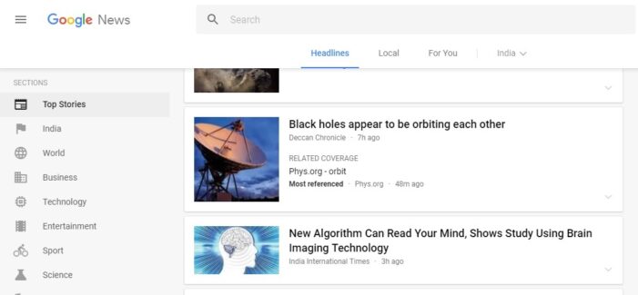
For those who had just visited Google News an hour ago would be surprised to see a new look of Google News page now, 11:20 pm on Wednesday, June 28, 2017. Beginning today, Google will have a new sleek look of its News Page, departing from the old Google News page that was changed slightly six years ago.
Here’s the Old Google News Page grab of India edition of Google News Page for those who may miss it or feel nostalgic about it. (No copyrights):

The new design is for readability, says the post citing some of the features such as — thenew UI has a clean and uncluttered look, designed for comfortable reading and browsing. “We’ve adopted a card format that makes it easier to browse, scan and identify related articles about a story,” reads the post.
The new layout focuses on better display of publisher names, which had earlier been so light and negligible. The article labels now maintain visitors’ view and place on the page as they click in and out of stories and explore topics, he said.
“We dedicated the navigation column on the left to sections that you customize. You can jump quickly to news you enjoy, whether it’s standard sections like Sports or Entertainment, or those created by you and powered by your queries, such as “FIFA World Cup” or “Bollywood,” said the post.
At the top of the page, a new navigation bar for “Headlines,” “Local” and “For You” attract the reader’s attention, which come to life once the reader signs in and personalizes the “Local” and “For You” tabs. In “Local,” one can track stories from any part of the world that he or she cares about—from their hometown to where they do business to where they went to school. “In “For You,” you can pinpoint niche interests and create your own mini news feed, whether it’s following your favorite team, or satisfying your inner geek with news on cool gadgets and gizmos,” wrote Anand.
Story Cards with different perspective on an issue. “The first view offers a quick glance into a story. From there you can go deeper and read articles with different points of view which are frequently labeled with helpful tags (e.g., Local Source, Most Referenced, Opinion, or Fact Check).”
“People have told us these labels identify important facets of a story and provide more context. As a result, whenever possible, we now show a second labeled article in addition to the top headline for each story. This way you can see additional context on stories immediately even as you are scanning.”
Next comes the “Full Coverage” page, as the name suggests, lets the reader immerse himself or herself in coverage about a story or issue that they want to deep dive into, writes Anand, revealing the changes made to the Google News page.

